Wednesday, December 16, 2009

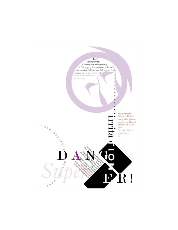
2 page spreads


So here are the two page spreads that I did for my typo final. I love the Katy Perry one just for the vector. Min Wang was horrible and I redid it so many times just to appease the prof that I never wanted to look at anymore of Min Wang's work or biography.

The best vector i have ever done.


So for my last type project I decided to be an over achiever and VECTOR A HUMAN. I think I am totally crazy, but I am incredibly happy with the result.

Saturday, November 21, 2009

Super 77


I never want to look at a super 77 can again. We had to do 24 different initial comps based off of the text of a super 77 can. After many late nights and one all nighter they are finished along with the box that I constructed to store them in. These are all printed out on transparency sheets so pretend that everything that is white is actually clear.

Fonts


So, I haven't posted on this in forever. Just haven't been as motivated to since it stopped being a class requirement. Anyway, taking a typography class (yay!). And what would a type class be without making fonts. These are my two fonts Zephyr and Showy. I spent about 2 weeks on Zephyr and 30 min on Showy, so of course Showy gets the higher grade and the most positive comments... I need to start half assing more I guess.

Monday, May 4, 2009

Best Marker Comp


I felt that this was my best display of a marker comp. This was my favorite piece to work on throughout the semester and I think that interest in the subject matter helped me to create this comp. I felt that the background could have been blended better, but other than that it was a successful marker comp that accurately portrayed the finished product.

Friday, May 1, 2009

Best Design Concept


So, this is the 3rd time I have uploaded this image (I really like it ) I felt that this showed the best use of the design elements of all my pieces. The larger picture on the left balances out the mass text to the right. The picture also leads the viewer to the large text body by using its organic shape that comes to a point, pointing at the text. Also, the warm colors of the dancers contrast with the cool colors of the background bringing in the attention of the viewer. The abstract shapes of the background add movement to the work and hold interest without overpowering the text. Finally, the use of text boxes point out attention grabbing quotes from the text that will intrigue the reader and make them want to know more.

Best Typography


This was a difficult choice for me, I did not quite know which method of typography was best for choosing this, so I just stuck with one that shows capability (I.E. text wrapping, using multiple texts) but still was simple enough to not distract from the message. I though that this also effectively unified the type with the photo by giving the whole poster an elegant feel without using that gaudy cursive type that many like to use in more "classy" ads.